Gustless in Glasgow
Scottish Nationalists think they're being robbed of wind gold. They needn't worry.
“It is never difficult to distinguish between a Scotsman with a grievance and a ray of sunshine.” P.G Wodehouse. The Heart of a Goof. Herbert Jenkins, 1926.
THIS WEEK, SCOTTISH Nationalists are up in arms again. This time, it’s over the regulatory approval and go-ahead for a multi-billion pound subsea cable for transferring electricity generated by wind farms located in Scotland to consumers in England. “It’s oor wind gold!”, they shout, “We should keep it here and get free electricity!”
Copper wire was invented by two Scotsmen fighting over a penny, and a certain lack of enthusiasm for sharing is part of our charm. The problem in this case, though, is that there’s not much to share, and certainly no wind gold. Let’s look.
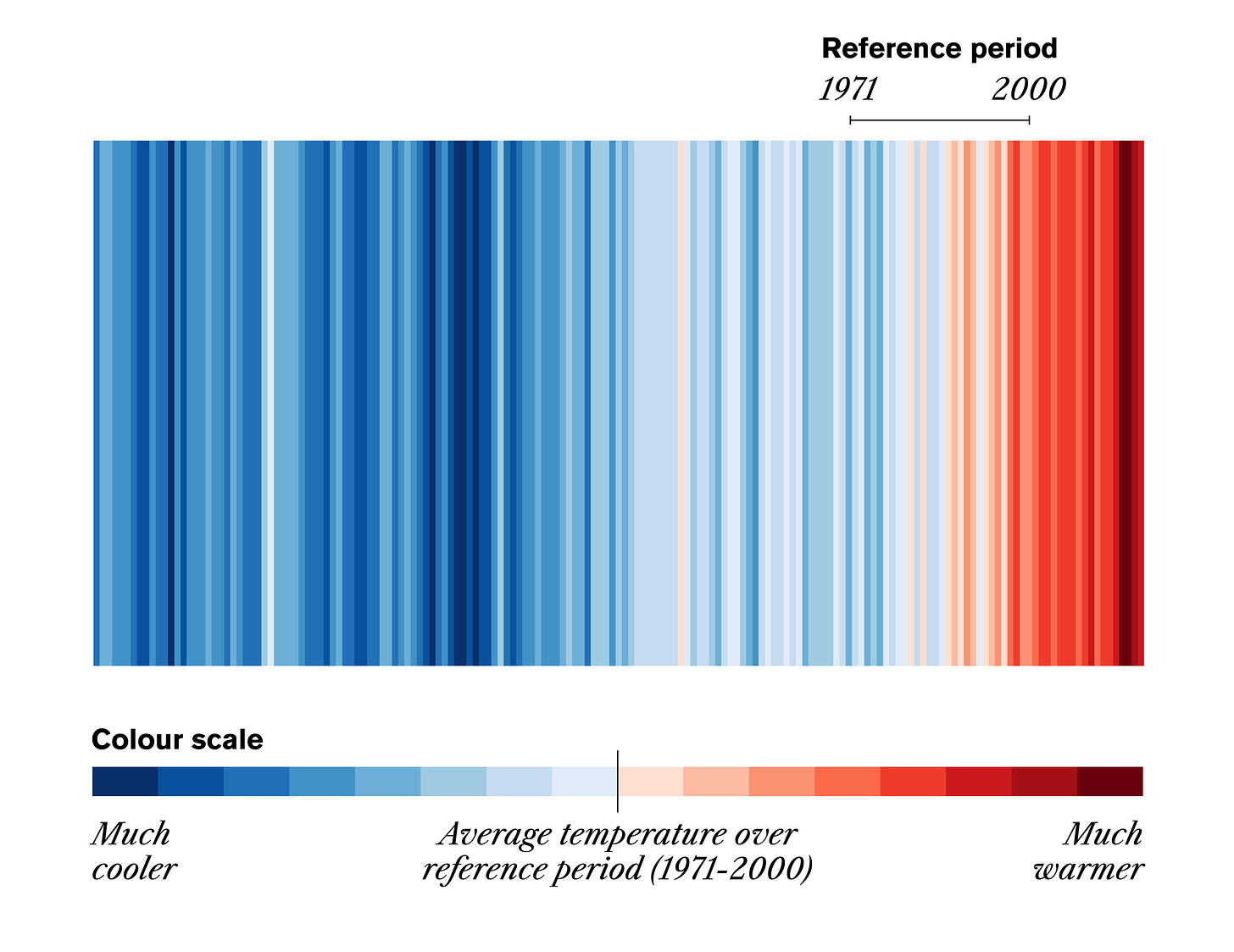
YOU’VE NO DOUBT seen them. “Warming stripes”, or “Climate stripes”. They’re a data visualisation technique that uses a chronologically ordered series of coloured strips to represent the way that we are encouraged to believe that temperature is changing. It’s coupled with the trick (their term) of making earlier temperatures cooler than measured and recent temperatures warmer than measured1 to intensify the illusion of a weather malfunction.
Climate scientist Ed Hawkins, inspired by knitted woollen hats and scarves, developed the technique. It was deemed to have such a powerful subliminal effect, and to make such a valuable contribution to the process of covert manipulation of public opinion, that he was awarded the Order of the British Empire in 2020 "for services to Climate Science and to Science Communication".
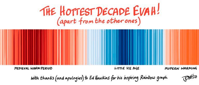
The internet being what it is, there is of course a splendid tradition of mocking it:
But, when used in good faith, the carpet plot (to give it its proper title) is a useful data visualisation tool. We can use it for a little visualisation of our own to figure out how much wind gold the Scots are being robbed of.
IT’S QUITE straightforward. The National Grid helpfully publish UK wind generation at 5 minute intervals all the way back to 2016. We can divide wind generation at any point by the “installed capacity” — the amount that would be produced if every turbine was producing what it was designed to produce — to compute the “capacity factor” of the system. Then we can plot that capacity factor over time, either as a regular graph, or as a carpet plot.
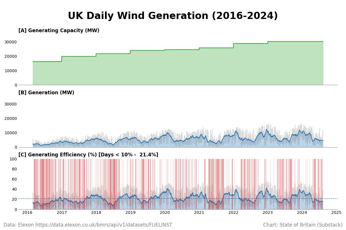
Here’s what that looks like. First, installed capacity, generation, and capacity factor:
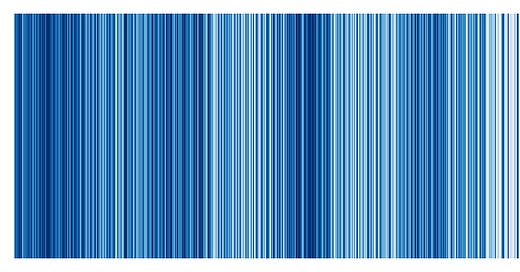
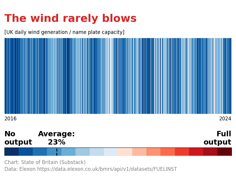
Ignore the red verticals in [C] — I’ll explain those in a second. Take capacity factor and render it as a carpet plot. “Wind Stripes”, so to speak, although I doubt we’ll get an OBE for it.
A few things are worth pointing out here.
UK Government Energy policy economics are based on an assumed capacity factor of 25% rising to 45%. Average capacity factor in any year never exceeds 23%. It’s as though we’ve paid for a car capable of 100 mph, and only get 23 mph out of it.
It was about 23% back in 2016 when system capacity was 16 GW. It’s about 23% today when capacity is 30 GW. That claim that efficiency will improve as technology advances and the system gets larger because “the wind is always blowing somewhere” is observably false.
It’s also highly seasonal. You can see the light blue of the stormy winter months, when they still get less half the design output out of them. And you can see the dark blue of the gentle summer months when they are idle. We’ll come back to this wind drought that occurs every year between March and September in a future essay, when we’ll estimate what the cost of battery storage would be to keep the country’s lights on.
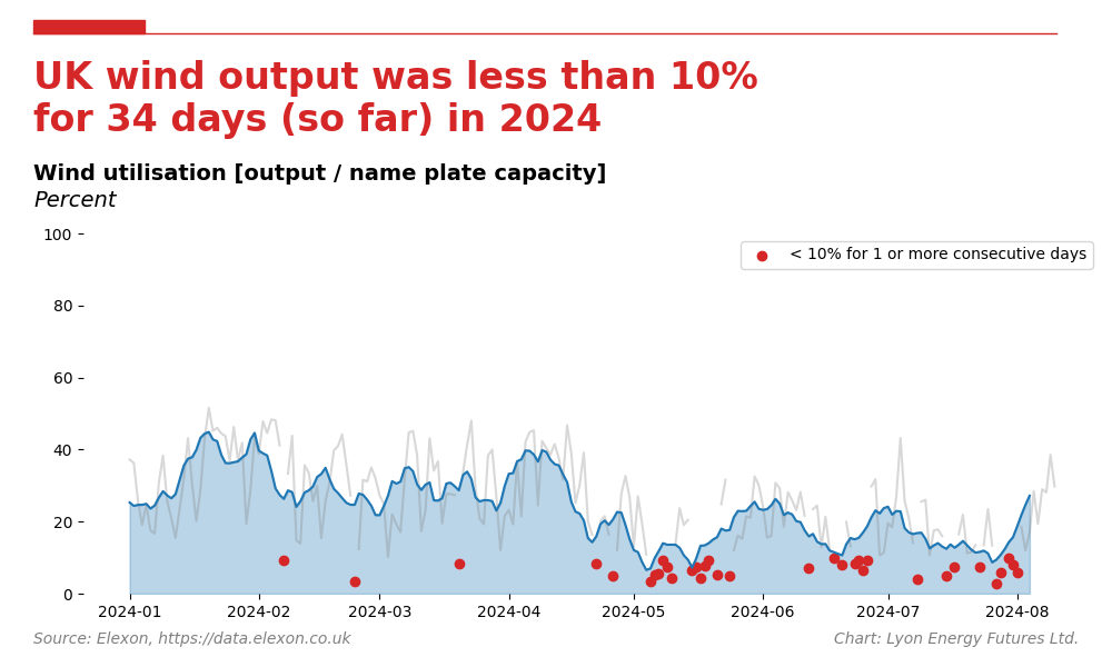
In fact, look again at subplot [C] in Fig 3. See the red vertical stripes? Those are all the days where that day’s average output is less that 10% i.e. wind generation is producing almost nothing. It’s worth examining these a little closer. Here’s 2024 so far:
So far this year, Britain’s wind system has produced next to nothing on 34 days — many of them consecutive — and around 21% of capacity on the other days for lack of sufficient wind.
Nationalists are fighting over a penny.
It will be fairly obvious, looking at this, why wind developers are now extorting the Labour government for even more subsidy money to compensate them for the loss they make in unsubsidised wind production. Professor Gordon Hughes at the University of Edinburgh’s Department of Economics notes that the push for larger and larger units is having no impact on capacity factor,2 and we can see that empirically.
Yet Labour intends now to double onshore wind capacity and quadruple offshore wind, adding £15 billion, or £555 per household per year, to our energy costs.3
We have to say No to Net Zero.
For a survey of this, see Heller, T. (2024) The 50 PPM Rule For Data Tampering. Available at:
Hughes, G. (2020) Wind Power Economics – Rhetoric and Reality. Available at: https://www.ref.org.uk/ref-blog/365-wind-power-economics-rhetoric-and-reality (Accessed: 25 November 2022).
What shall we do with the drunken sailor? (no date) Net Zero Watch. Available at: https://www.netzerowatch.com/all-news/miliband-drunken-sailor (Accessed: 17 August 2024).



Richard,
Some thoughts (US based) on storage requirements and costs to make wind and solar dispatchable.
https://www.therightinsight.org/Current-Storage-Deficit
This is a joke. The local council in Launceston, Cornwall recently said no thanks to a proposed solar farm which would have generated power for 11,000 homes....undaunted EDF is trying to install one on 200 acres of productive farmland near Truro instead, which would supply 9000 homes. The land has been farmed since medieval times. 200 acres, for a measly 9000 homes. You could cover the entire country in solar panels and it would still not generate enough power for the whole UK. This is all madness, utter madness.